The two title sequences I watched on Art of the Title are both two completely genres and this is shown by the way the title sequences of each film is portrayed.
The title sequences background music was happy and upbeat, which suggests the film is a comedy because of the pop music representing an exciting and funny atmosphere - this is also shown by the diegetic sound of laughter and screaming. The images of teenagers partying, drinking and smoking weed represents the stereotypes of teenagers enjoying their youth. Also, the use of dramatic animations such as explosions, bullets and gunshots show the action in the film as well as the humour.
The font used in the title sequence are in capital letters which are all bold, and the colour of the font is white which makes it look simple and helps the audience concentrate on the footage behind the text. The credits are shown in the order of the directors, screenplay, story by, creators, producers, photography, designer, editor, casts, casting by, music and lastly costume designer. The credits slide through the right or left of the screen before staying in the middle of the background image. Also, the credits match the background images for example an image of a type writer will be shown whilst the credit is who the screenplay is by.
The reason I picked this title sequence because it is really interesting and overall shows the genre of the film clearly by the dramatic animations and music.
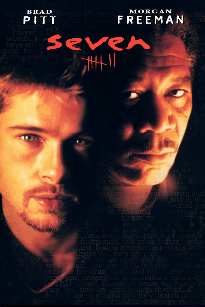
Se7en is an American psychological thriller film.
The title sequences music creates an eerie feeling that highlights the psychological thriller genre, and the diegetic sounds of a women screaming gives a sense of danger and helplessness which helps with the horrific theme and atmosphere being created.
The credits start with the productions, the film by, the two main casts, title, remaining cast, casting by, music by, costume designer, editor, production designers, producers, writer and lastly the director. The colour of the font is white which makes it stand out against the black background, which was used majority of the time. They appear in a font that is fading which has a ghostly effect, it also resembles a handwriting which suggests someone is writing inside a book. This contrasts back to the end of the film, as the writer is shown as the killer.
The colours used in the title sequence are mostly black and white, however as the images of the props are shown such as blades and books a bit of colour is shown. But they are shown under dark lightning, which shows that this is film will be really serious and there is no humour in it.
I decided to pick this title sequence because it was completely different to 21 Jump Street. Also, it shows the differences of how title sequences are portrayed to help the audience understand the genre of the film, however the credits are still important as both the title sequences showed an equal amount of credits.


No comments:
Post a Comment